The Best of Both Worlds: The Design Power of 'Greige'
According to the paint color experts at Zillow, when it comes to home design, the right color matters. Painting a home’s exterior in a neutral color will attract buyers and create a greater incentive to spend. The money winner is a trendy color known as "Greige.” It might sound a bit unusual, but Greige is an amalgamation of two words: gray and beige.
On average, painting the exterior of a home in the color Greige adds $3,500 of value, which fits in perfectly with Zillow's Chief Economist Svenja Gudell's assertion that “neutral colors give the appearance of a larger home and/or space while also keeping things looking fresh.”
New homebuyers at Elevon, an upscale master-planned community near Lake Lavon in north Texas, work with a professional team of builders to design the home of their dreams, They live in a vibrant community that offers convenience and all the lifestyle amenities they desire. Just like combining two colors into one to create Greige, living at Elevon affords a homeowner the best of both worlds!
Greige is All the Rage
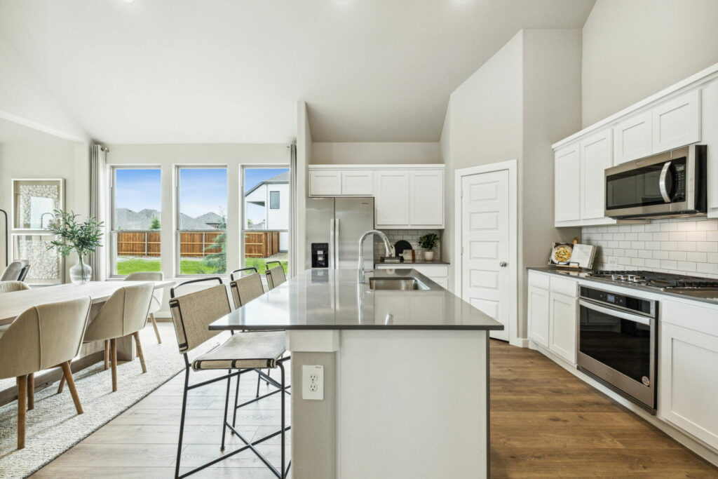
The color Greige is “au courant” and universally appealing. A neutral hue that strikes a balance between gray and beige, it adds just the right amount of warmth to a home while also providing a hint of coolness. A Greige color palette contains a mix of neutrals and color statements for contrast.
Homeowners can choose higher or lower energy colors for contrast, depending on the mood they wish to evoke. For example, one home palette that utilizes Greige might include it as the base color, using white elements as a contrasting neutral and blue pops for a low-energy statement. High-energy contrast would include bolder colors like mustard, burnt orange, navy, or deep green. Greige color palettes have a freshness that will stand the test of time. Even though it’s a 2024 “must-have” for interior designers, the Greige color palette reflects a classic element that will never go out of style.
Why Gray?
Gray pairs effortlessly with bold and muted tones, while blending flawlessly with diverse design concepts. A neutral color, gray showcases artwork, furnishings, and accessories as the focal points in a room. It’s a perfect color choice to highlight contrasting textures and patterns and further emphasizes the tactile qualities of sophisticated room design.
A gray palette is often paired with minimalist designs that emphasize simple refinement and uncluttered looks, or an industrial design enhanced by metal finishes and reclaimed materials. On the other hand, there are gray palettes that evoke a cozy feeling by incorporating a warm brown undertone. Certain colors remain enduring favorites. For example, Sherwin Williams' “Agreeable Gray” has been a popular choice for quite some time.
Why Beige?
Beige is universally popular as an interior design color palette. It’s subtle and relaxing to the senses. Warm neutral colors are standard foundations that never go out of style. The design concepts that use the color beige are almost limitless, at least according to PPG paint. They have chosen a warm honey beige called Limitless to be their 2024 color of the year. Why? The company says Limitless “instills a warm, sunny vibe that hints at growth and blooming energy.” Designers note that neutral is best. To choose the right neutral wall color, look at the undertones of the space as well as the amount of light it gets.
Greige is a Twofer!

Greige is generally considered the chameleon of the neutral color palette, prized by design professionals for its versatility and understated elegance. The ratio of beige to gray in the color Greige determines whether it is a cool or warm neutral. It’s simple. Greige with a stronger gray component will be called a cool neutral and one with more emphasis on beige is a warm neutral. Either way, the decision is yours!
It’s Elementary
When building a home, there are many decisions to think about. Luckily, the construction professionals at Elevon can simplify the process. Many builders include in-house design teams that have curated interior design elements, individualized color palettes, and other style choices for a buyer’s consideration.
For example, K. Hovnanian Homes offers Looks, a collection of four hand-picked design collections to support home buyers and streamline the process. Union Main Homes offers new homebuilders a selection of design packages reflecting options for individual tastes and styles. Pacesetter Homes has prepared a select gallery of photos to make it possible for their clients to choose a style, colors, and construction design that’s perfect for them.
Equilibrium: A Balancing Act
The color Greige has been described as “the essence of balance”. Attention to detail is a subtle way to create equilibrium and making the conscious choice to balance your life can be achieved at Elevon, a community that puts a premium on health and happiness.
You can have the best of both worlds! Click here to schedule a tour today.